The Problem
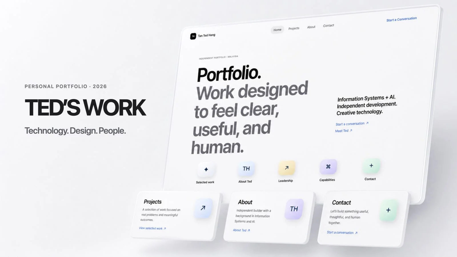
A portfolio should make a person easier to understand, not bury them under effects. This site gives my technical, leadership, and creative work one coherent home while leaving room for the next project.
The Intention
My GitHub profile is designed to be scanned quickly. This website has a different job: it gives the work room to breathe, explains the choices behind it, and shows how technical thinking, leadership, and visual storytelling connect.
Design Decisions
The identity stays dark, blue, and luminous, but the layout moves away from a dashboard of cards. Large statements create rhythm, real project imagery carries evidence, and JetBrains Mono is reserved for technical labels instead of long paragraphs.
The Technical System
Astro generates every page as static HTML. Biography and case studies live in Markdown, contact and navigation values live in one TypeScript file, and a curated GitHub metadata layer enriches only approved projects. A committed snapshot keeps builds dependable when GitHub is unavailable.
The Challenge
Liquid-glass effects and moving light can quickly reduce readability or performance. The solution is restraint: a few large ambient layers, independently tinted reading surfaces, CSS-first motion, and a static foundation that works before JavaScript runs.
What I Learned
Visual polish is strongest when it clarifies hierarchy. The most useful animation is often the smallest one: a press response, a section arriving at the right moment, or a material shifting just enough to show depth.
Next Iteration
The content structure is ready to grow one project at a time. New repositories remain private to the portfolio until I deliberately feature them.